
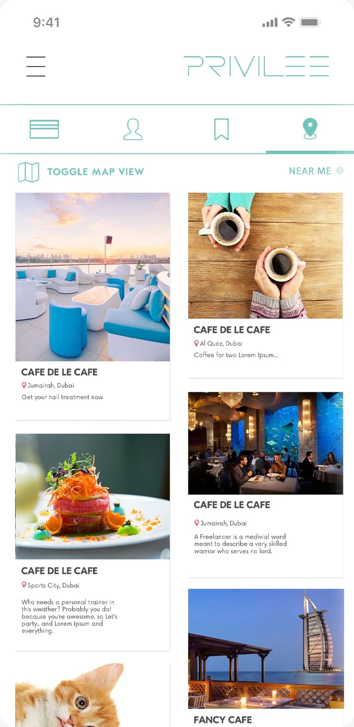

Works in a bank, lives in Abu Dhabi, trains every day. He needs a gym near him, wherever he is: Near me.
Loading Mowgoud.
Getting everything ready before you enter.
A member app that starts from what is relevant to each member, and three directions for the landing page.
A membership is worth what members use. The app starts from what is relevant to each of them.
Privilee calls itself the ultimate lifestyle membership: beach clubs, bars, restaurants, spas, gyms and kids clubs in the UAE, on one membership.
The problem, as the project put it in 2019: how do we enable our members to get the most out of their membership by helping them discover what’s relevant to them?
Each persona needed something different from the same membership, and each need became a tab.
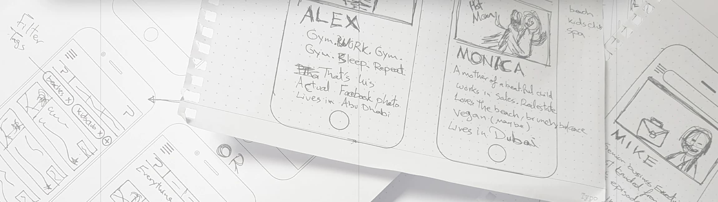
Works in a bank, lives in Abu Dhabi, trains every day. He needs a gym near him, wherever he is: Near me.
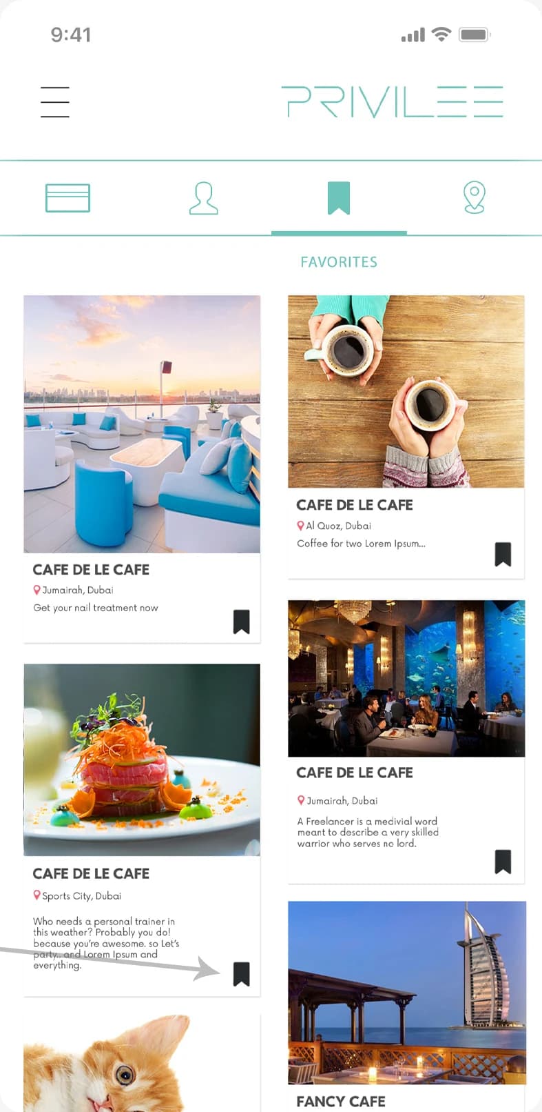

A business executive in Dubai with a busy schedule. He wants the status of his regular beach club, tennis court and bar, not new offers: Favorites.
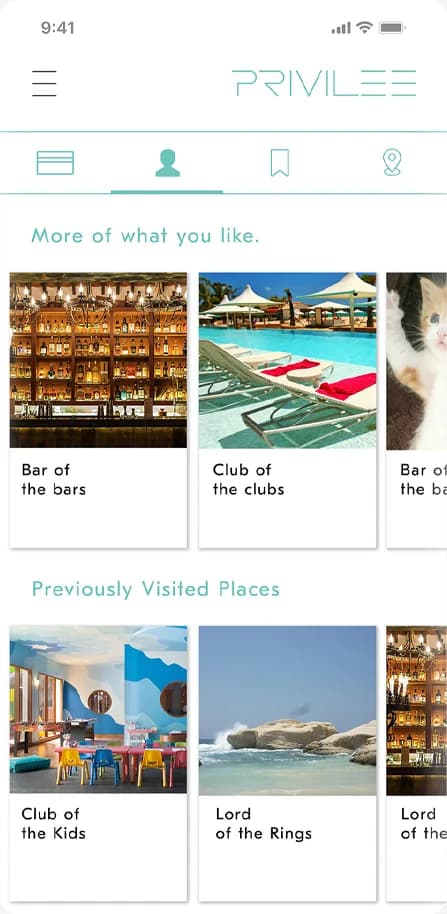

In sales, in Dubai, with a little girl. Open to new places, as long as there is a kids club: Personalized.
The personas and the screens started on paper: who they are, what they would tap, and which tab answers them.
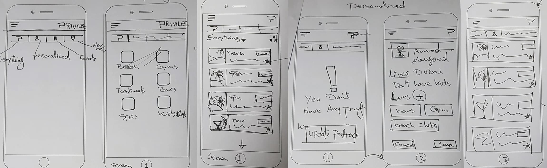
Signed-in members land on the homepage; everyone else signs in first. From there, four tabs.
Only Personalized asks something back: with no preferences yet, it sends the member to set them once, then lists their places.
A one-time setup turns Personalized from an empty tab into a focused feed.
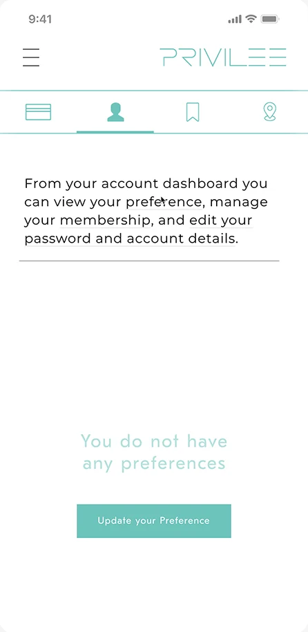
The account tab says so plainly, and offers one button.
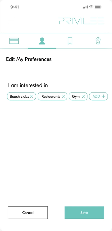
Tags in, tags out: beach clubs, restaurants, gym. Then save.
The feed leads with matching places, then the ones visited before.
Teal, the line logo, and two fields.
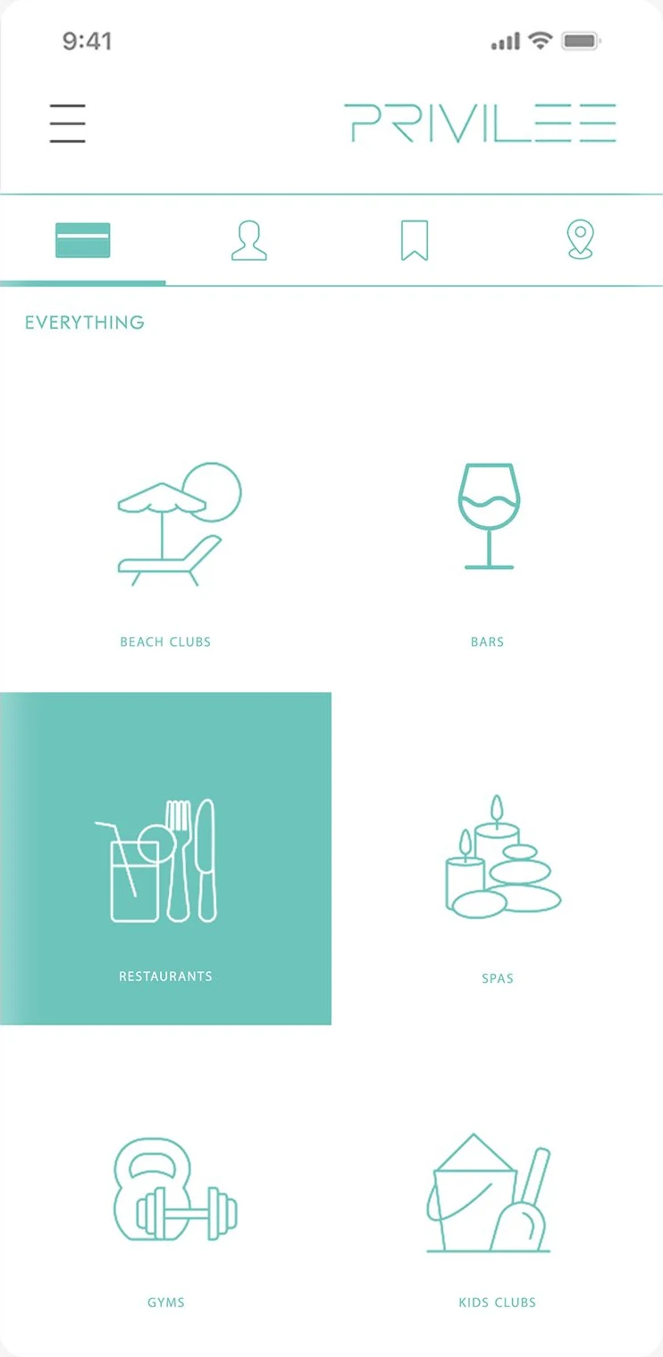
Six categories, drawn as line icons.
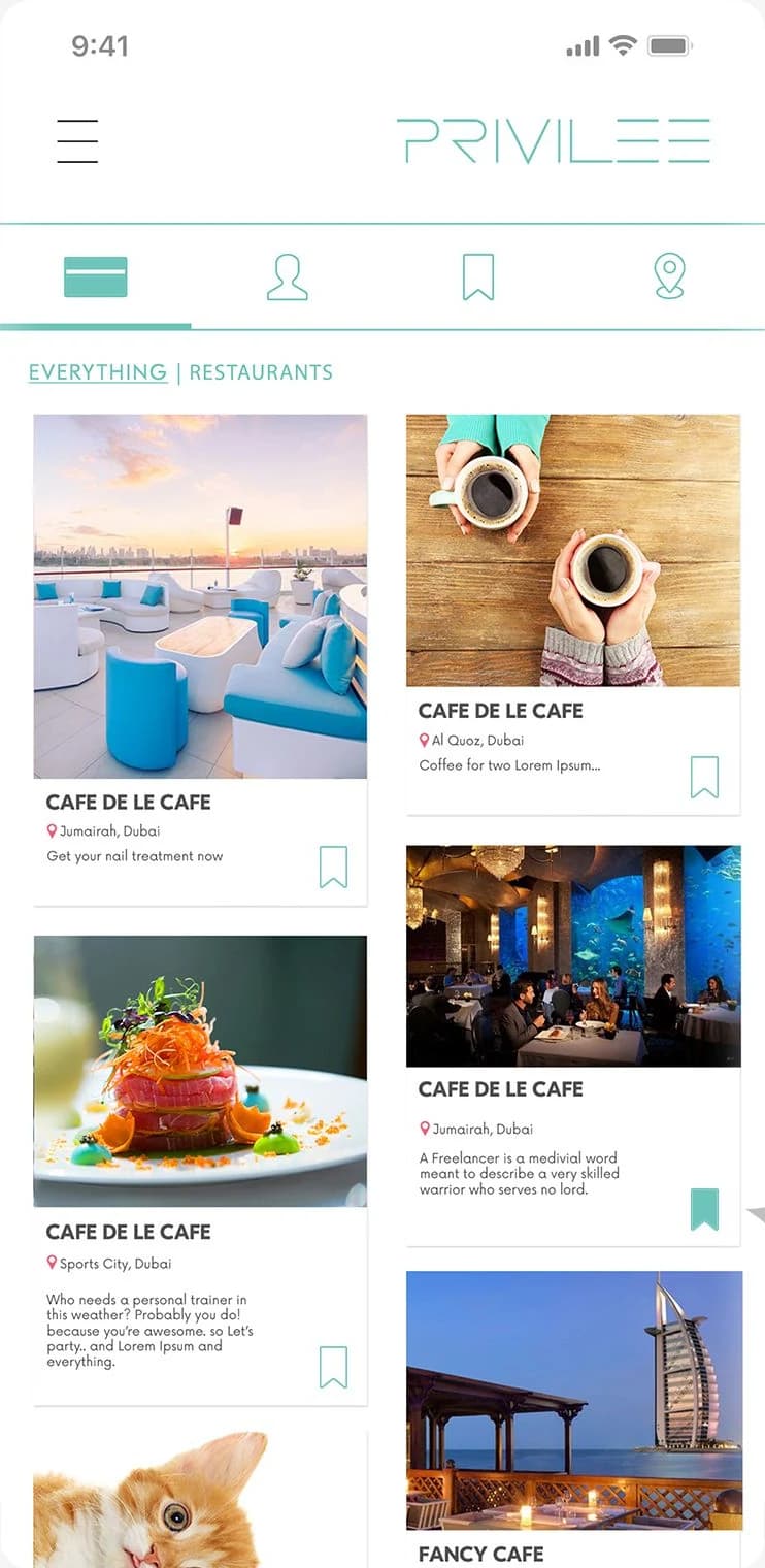
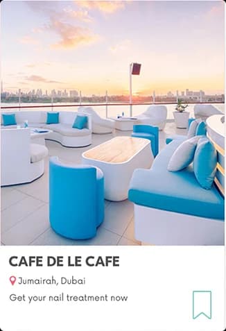
Places in a grid, each with its area and a bookmark.
Bookmark a place to keep it. Tap the bookmark again to let it go.
The places around you, as a list.
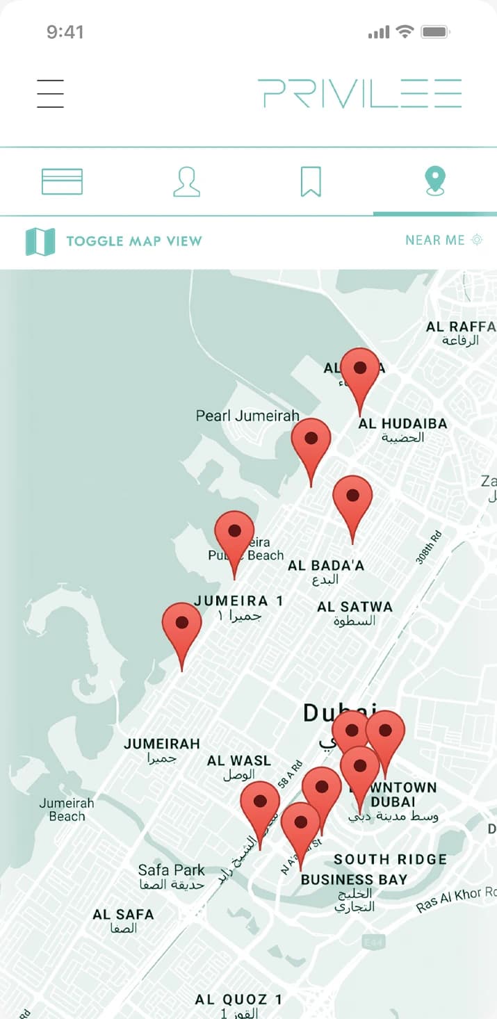
Toggle map view puts the same places on Dubai.
The website’s landing page, in three directions: the same cabana by the sea, told three ways.
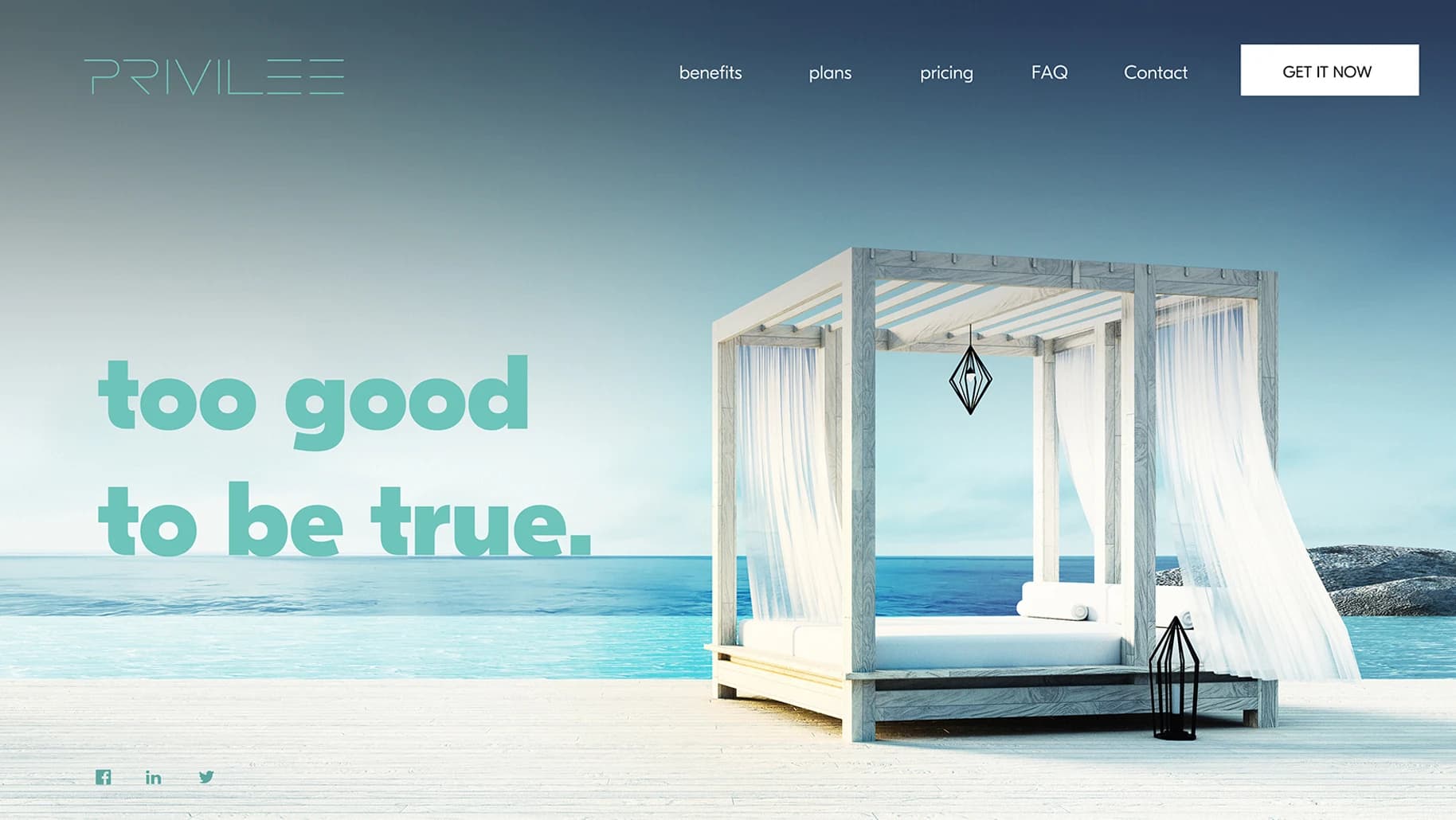
Too good to be true, in the app’s teal.
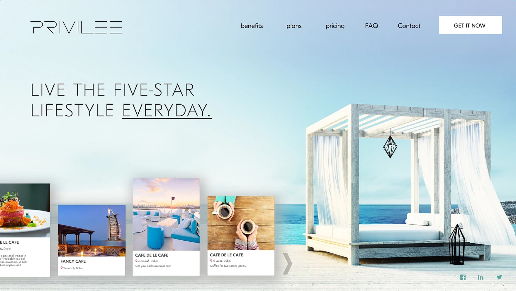
Live the five-star lifestyle every day, with places as cards along the bottom.
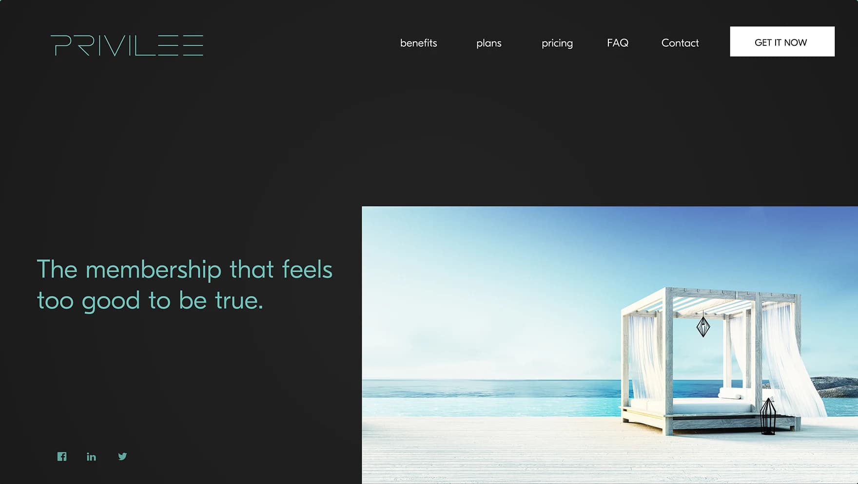
The membership that feels too good to be true, on charcoal.
The personas made the structure obvious. Alex, Mike and Alice wanted different things from the same membership, so the app gives each of them a way in instead of one long directory.
Personalized is the one tab that asks for anything, and it asks once.
Ahmed Mowgoud — UI/UX design